
Innovative Design Concept
Next Level
Next Level
Started as a study project, I further developed the concept of the initial task of this study project further, so that it not only benefits a single store, but is THE one app for all florists and flower lovers. This concept had been nominated for the
Red Dot Award: Design Concept.
Red Dot Award: Design Concept.
Concept Video:
But here we go with the in-depth UX design case study of the initial study project:
1. Project Overview
2. Empathize & Define
3. Ideate & Design
4. Finalizing Design
5. Going Forward
2. Empathize & Define
3. Ideate & Design
4. Finalizing Design
5. Going Forward
1. Project Overview
Task:
Design a flower catalogue app for a trendy florist
Design a flower catalogue app for a trendy florist
Product:
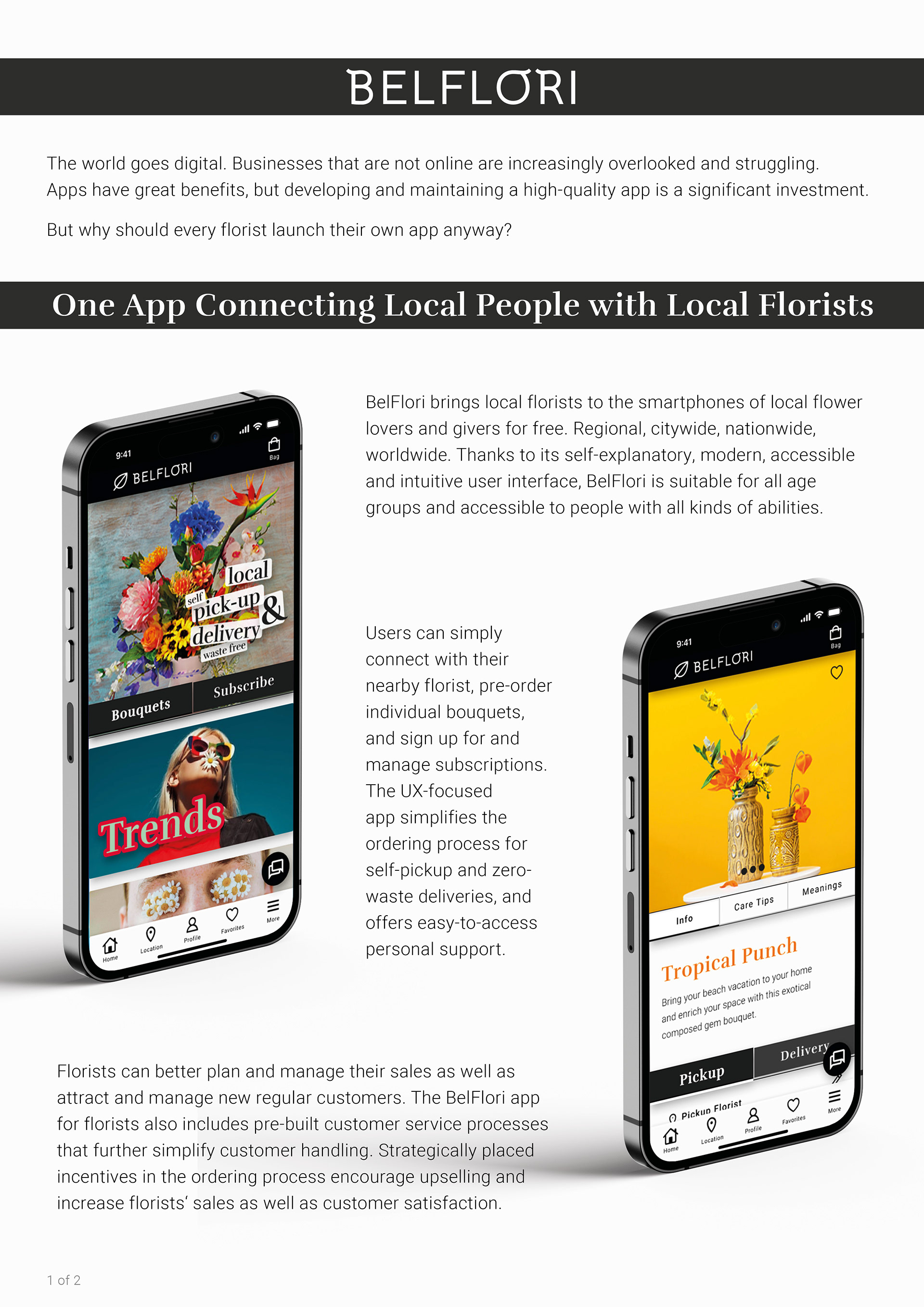
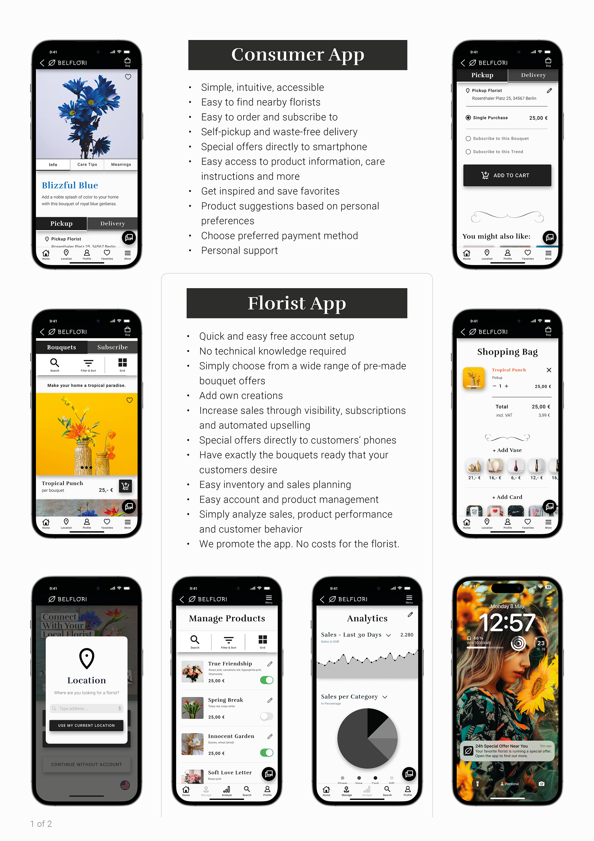
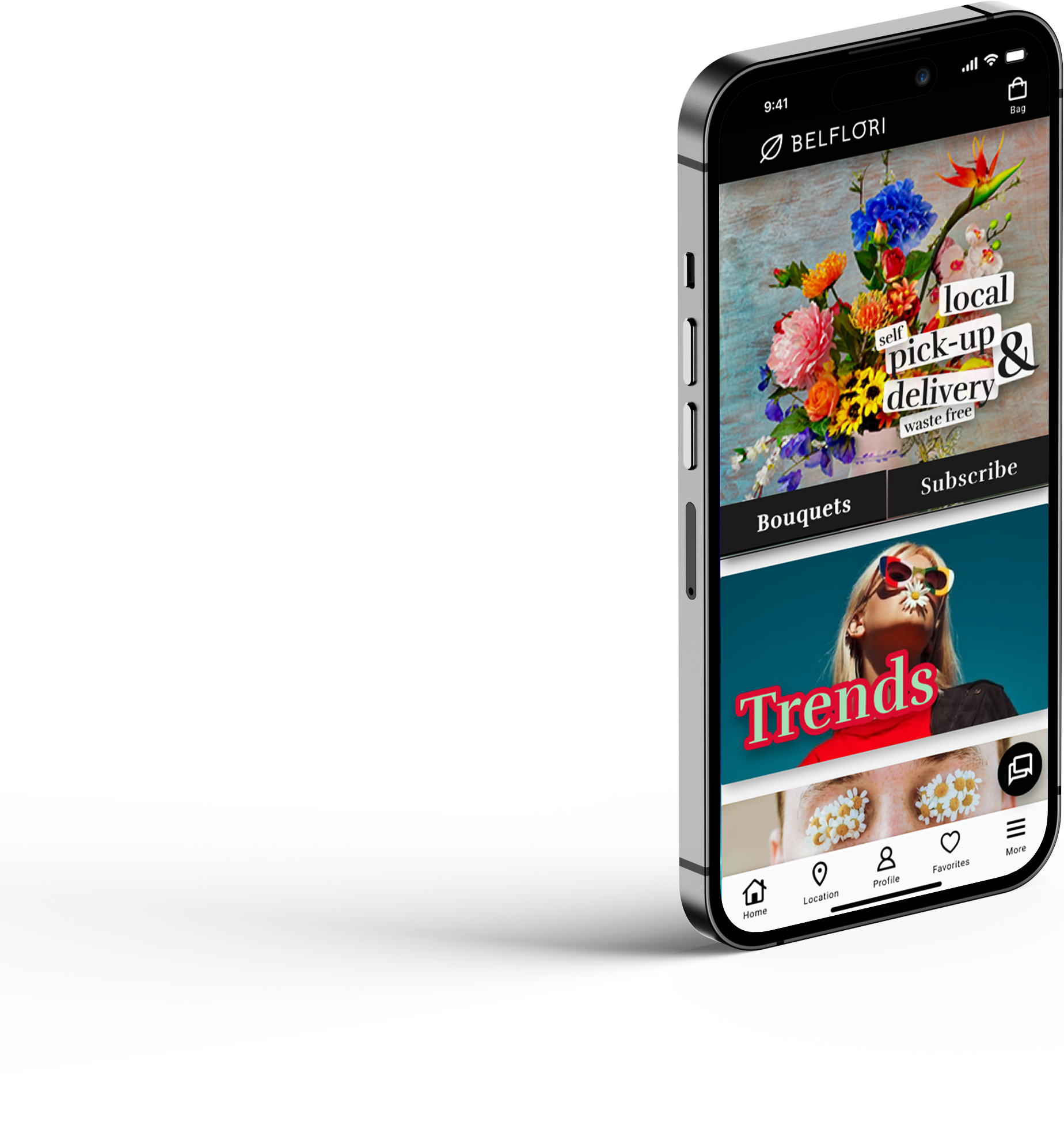
BelFlori is a local trend florist. Through their flower catalog app, they offer on-trend bouquets and flower subscriptions for locals to pick up themselves as well as local, trash-free delivery. BelFlori app targets environmentally and trend conscious local flower lovers and givers with busy schedules.
BelFlori is a local trend florist. Through their flower catalog app, they offer on-trend bouquets and flower subscriptions for locals to pick up themselves as well as local, trash-free delivery. BelFlori app targets environmentally and trend conscious local flower lovers and givers with busy schedules.
Problem:
Busy flower lovers and givers lack the time to take care of their flower errands. BelFlori wants to increase sales and build more regular customers.
Goal:
Create a simple, clear, user-friendly, and accessible app that showcases the floral offerings. The app is meant to allow customers to pre-order for quick self-pickup and order for local, zero-waste delivery. Customers shall have the option of a one-time purchase and subscription for both types.
My role:
UX designer & researcher
UX designer & researcher
Responsibilities:
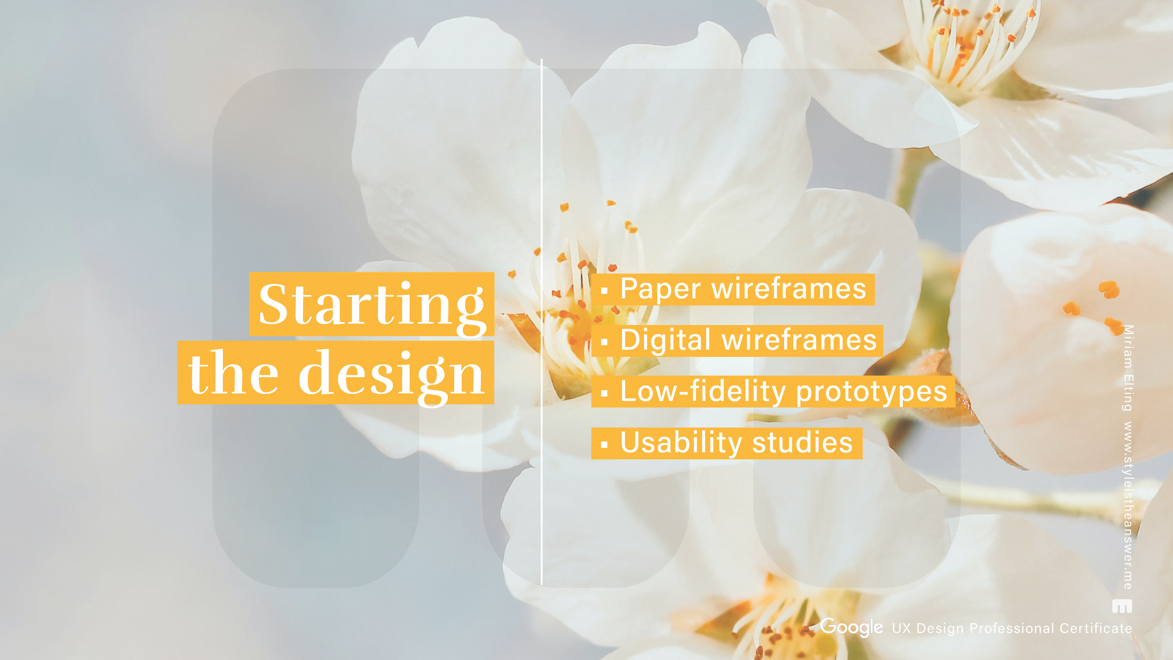
- Conducting interviews
- Paper and digital wireframing
- Low and high-fidelity prototyping
- Conducting usability studies
- Accounting for accessibility
- Iterating on designs
Duration:
Nov ‘22 - Feb ’23 (12 weeks, in depth learning)
Nov ‘22 - Feb ’23 (12 weeks, in depth learning)
2. Empathize & Define
“If I were given one hour to save the planet, I would spend 59 minutes defining the problem, and 1 minute resolving it.”
- Albert Einstein -
- Albert Einstein -
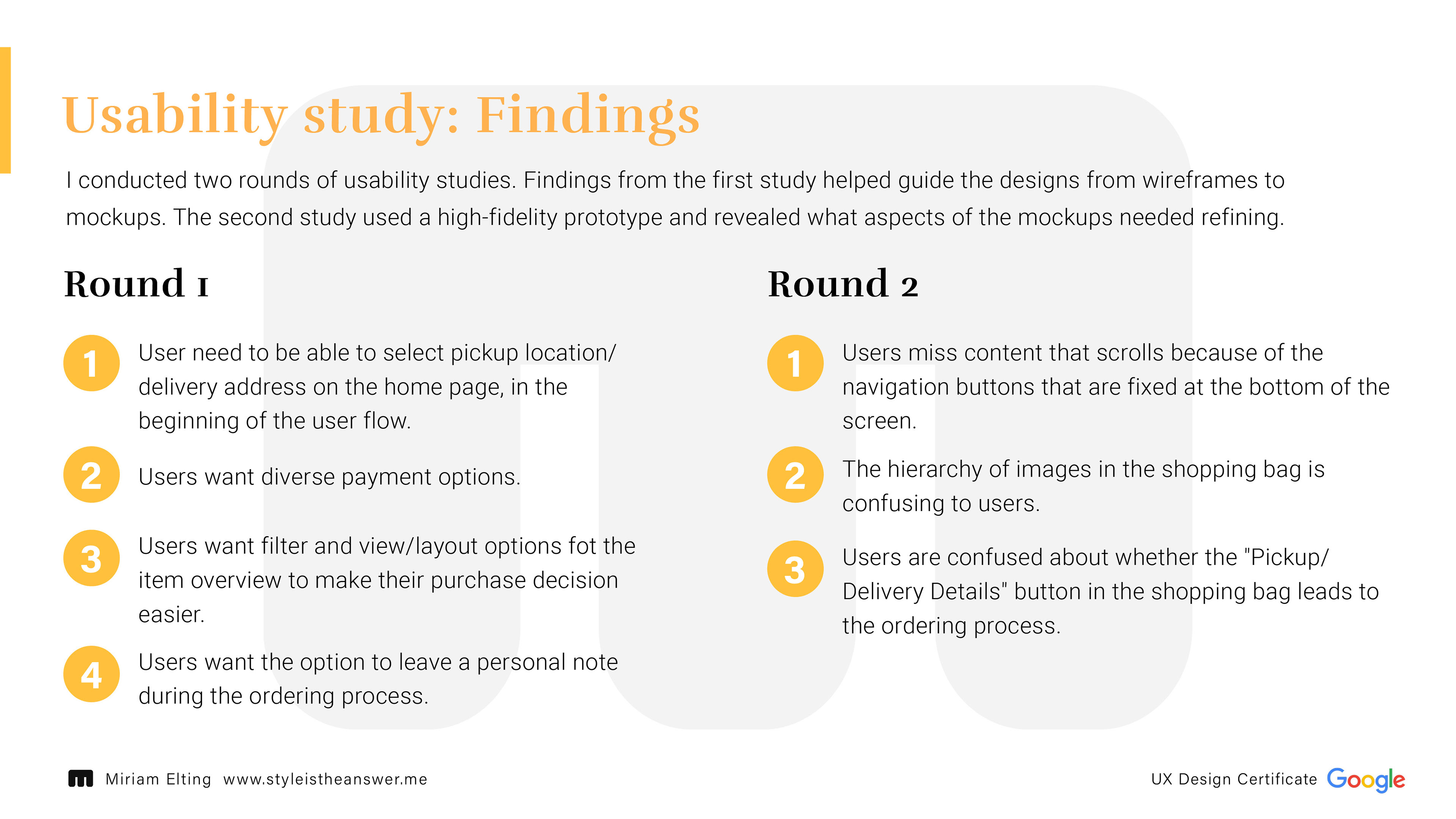
User Research: Summary
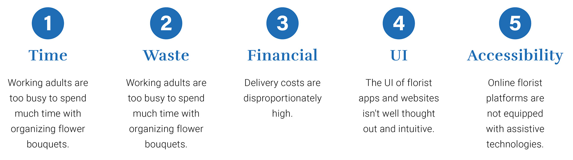
I conducted interviews and created empathy maps to understand the users and their actual needs. A primary user group identified through research is working adults with busy schedules. This group confirmed initial assumptions.
The research also revealed other reasons that prevent potential customers from buying flower bouquets online.In particular, relatively high delivery costs, high waste generation due to packaging, unclear and non-intuitive user interfaces and lack of accessibility were mentioned here.
The desire for the possibility of self-pickup and an uncomplicated subscription stood out.
User Research: Pain Points
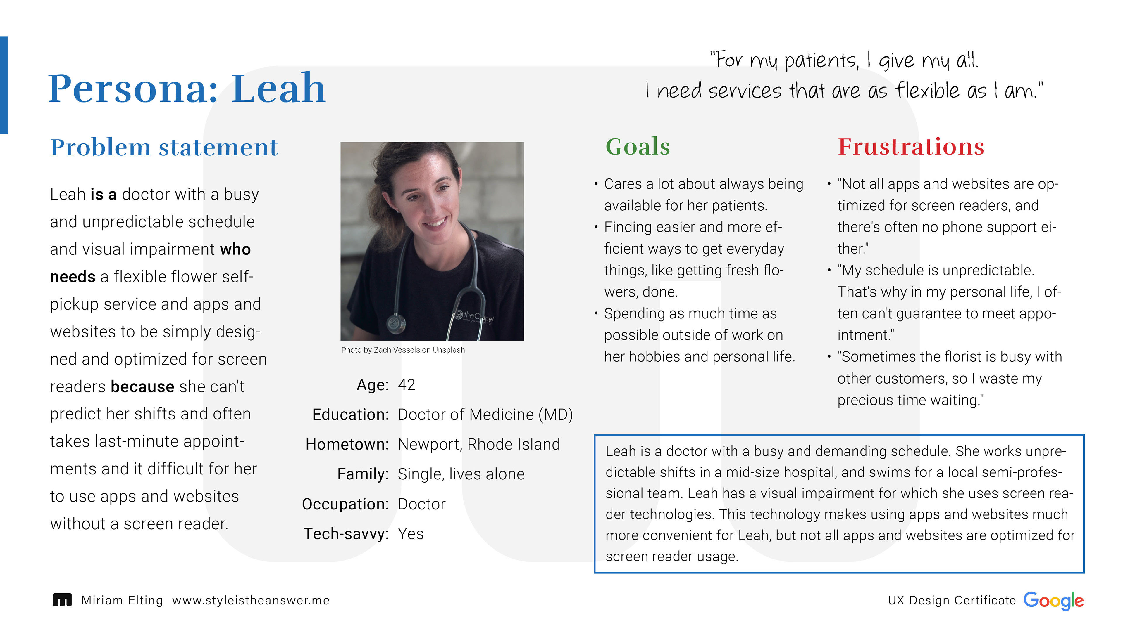
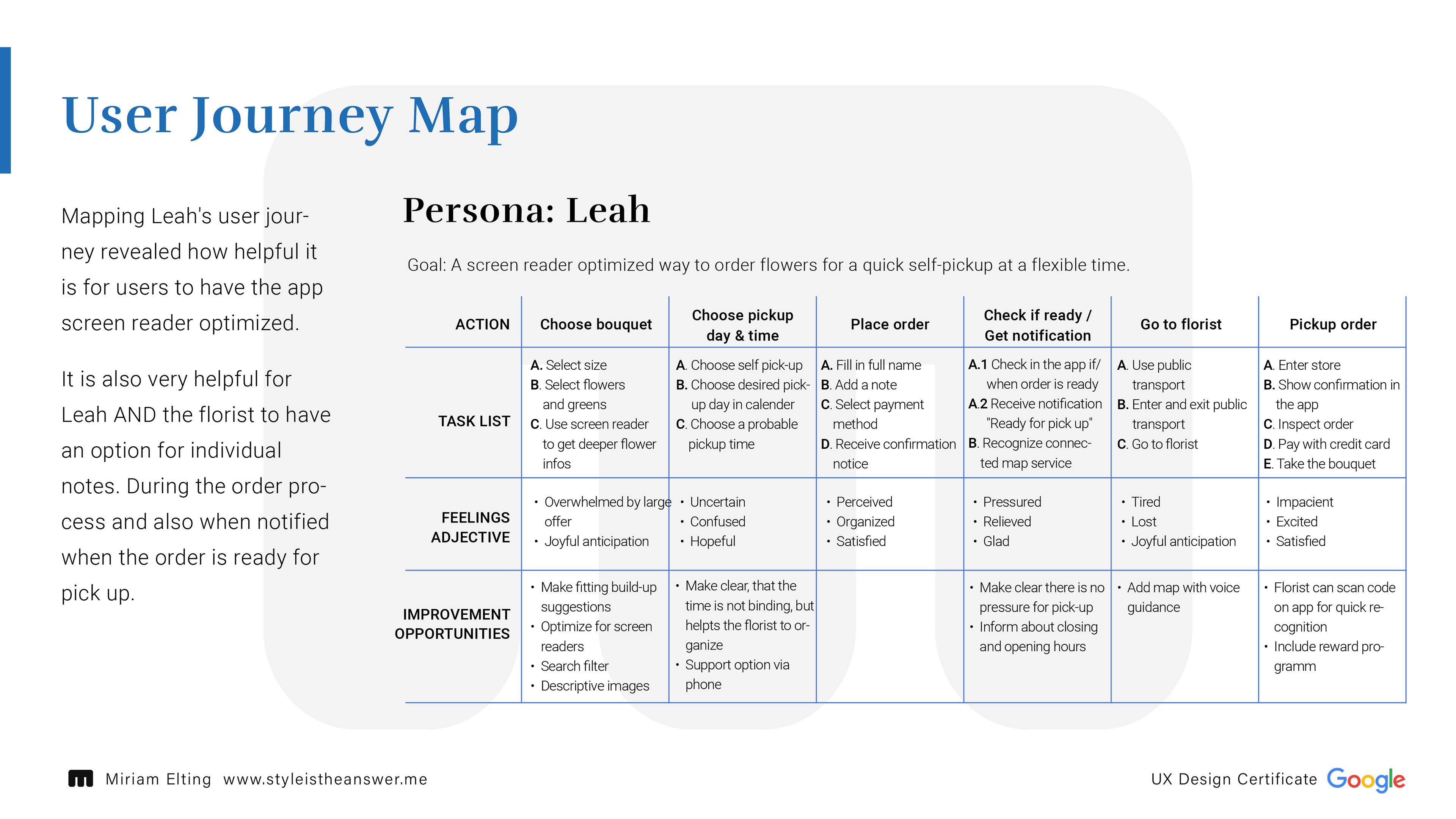
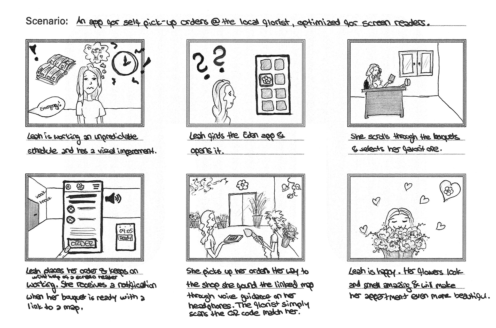
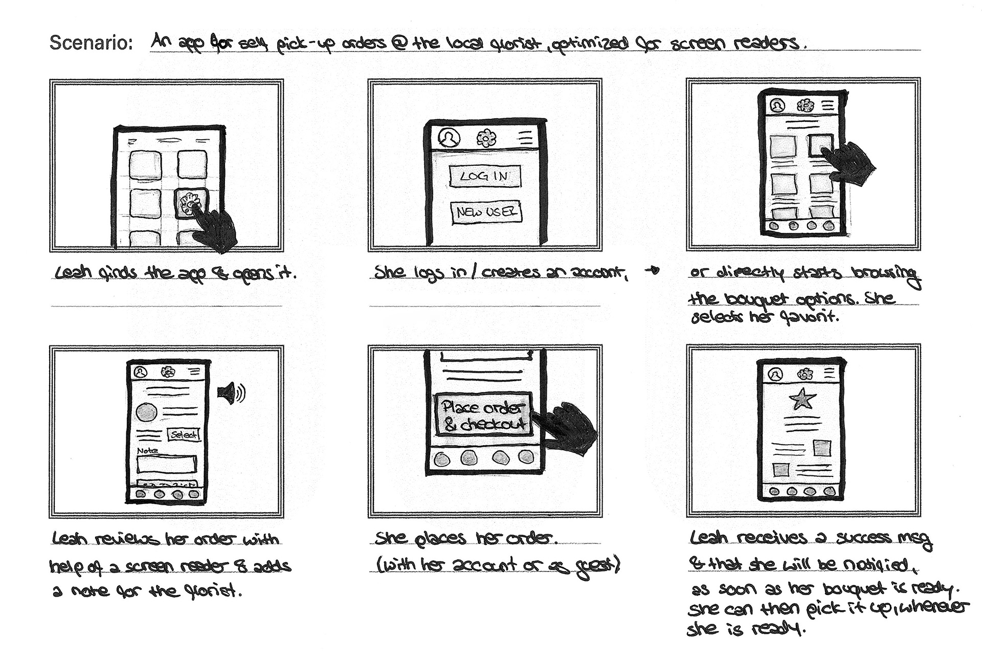
User Story: Leah
As a doctor with a demanding schedule and unpredictable shifts
I want to pre-order and self pick-up my flowers
so that I am able to get them on the way home, whenever I am ready.
I want to pre-order and self pick-up my flowers
so that I am able to get them on the way home, whenever I am ready.
As a doctor with visual impairment
I want to use apps that are optimized for screen readers
so that I can use them easily.
I want to use apps that are optimized for screen readers
so that I can use them easily.
Competitive Analysis
I looked at several potential competing companies and their online reviews. The majority of the competitors' features were very similar, although the majority does not take advantage of the benefits of an app.
The biggest OPPORTUNITIES for this app in the current market are:
- Clear, simple and intuitive user interface
- Accessibility
- Delivery without packaging
- Self-pickup
- Personal service (like at the florist)
- Possibility to support a local florist through the purchase
- Clear, simple and intuitive user interface
- Accessibility
- Delivery without packaging
- Self-pickup
- Personal service (like at the florist)
- Possibility to support a local florist through the purchase
3. Ideate & Design
Goal Statement
Our flower catalogue app will let users order flowers for a flexible self pick-up, which will affect people with unpredictable shifts by having the flowers prepared and reserved, and not having to stick to a specific pick-up time.
We will measure effectiveness by analyzing the number of daily and weekly purchases/self pick-ups.
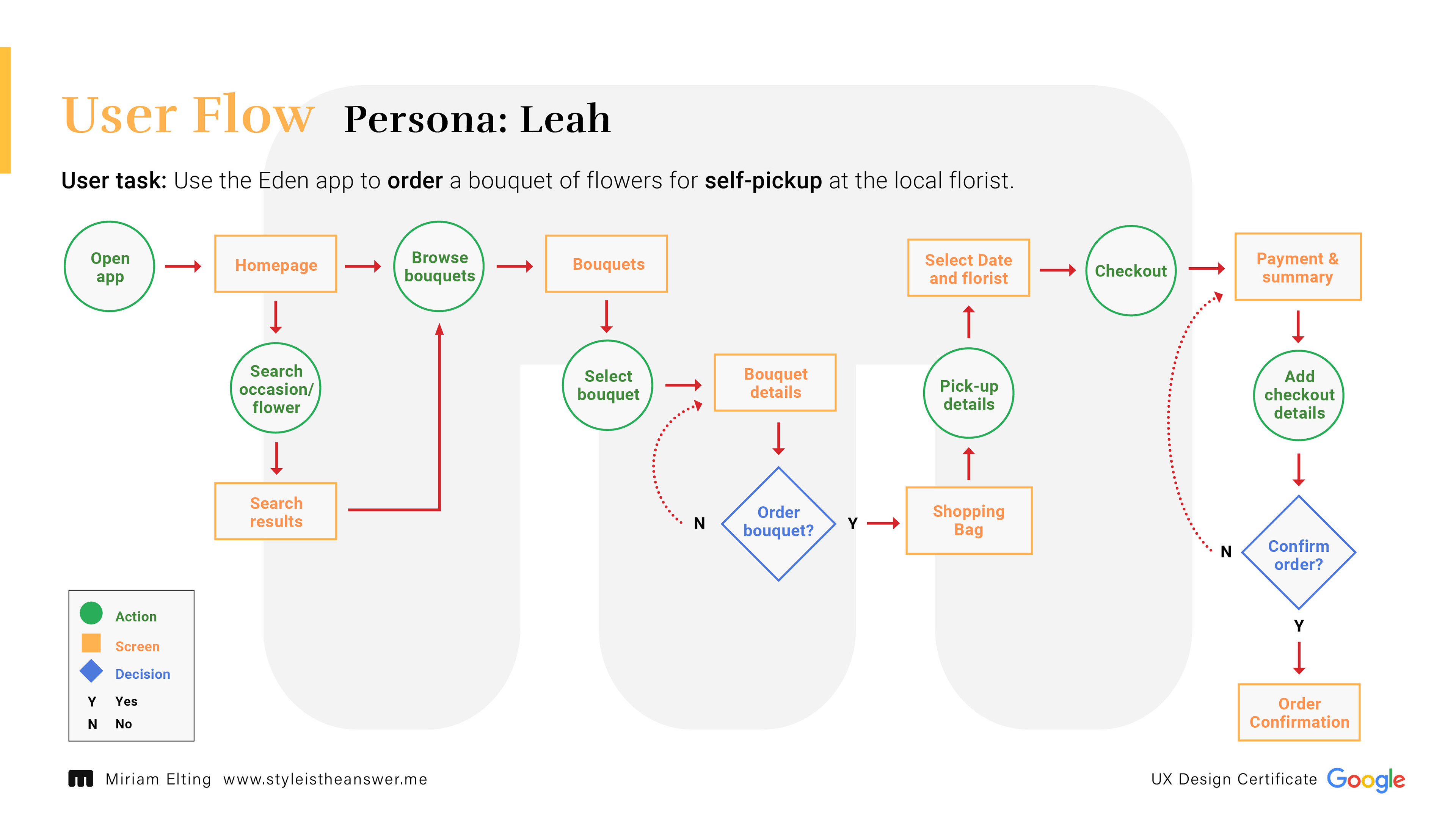
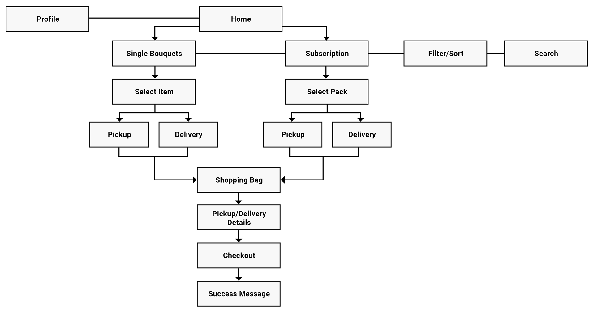
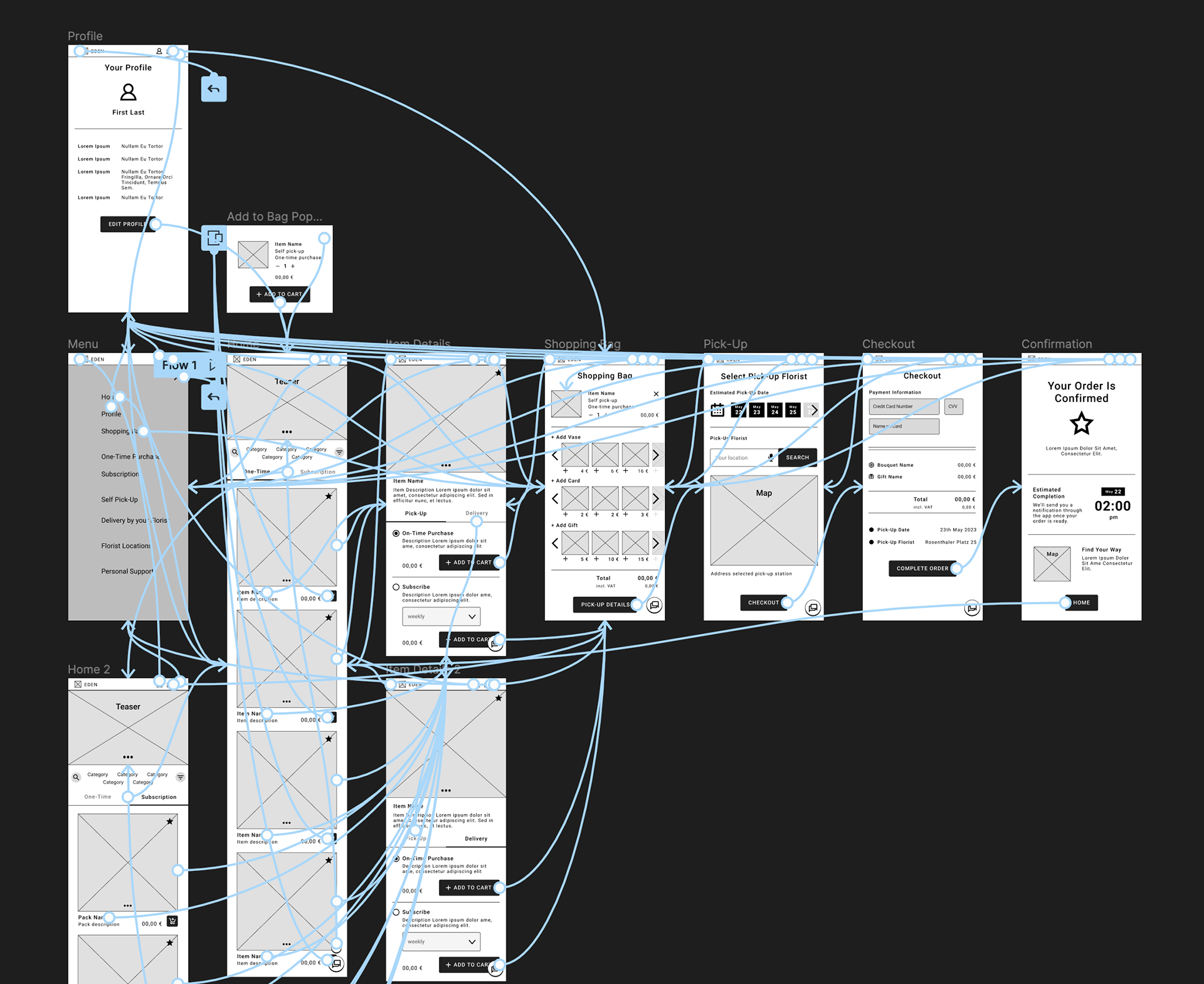
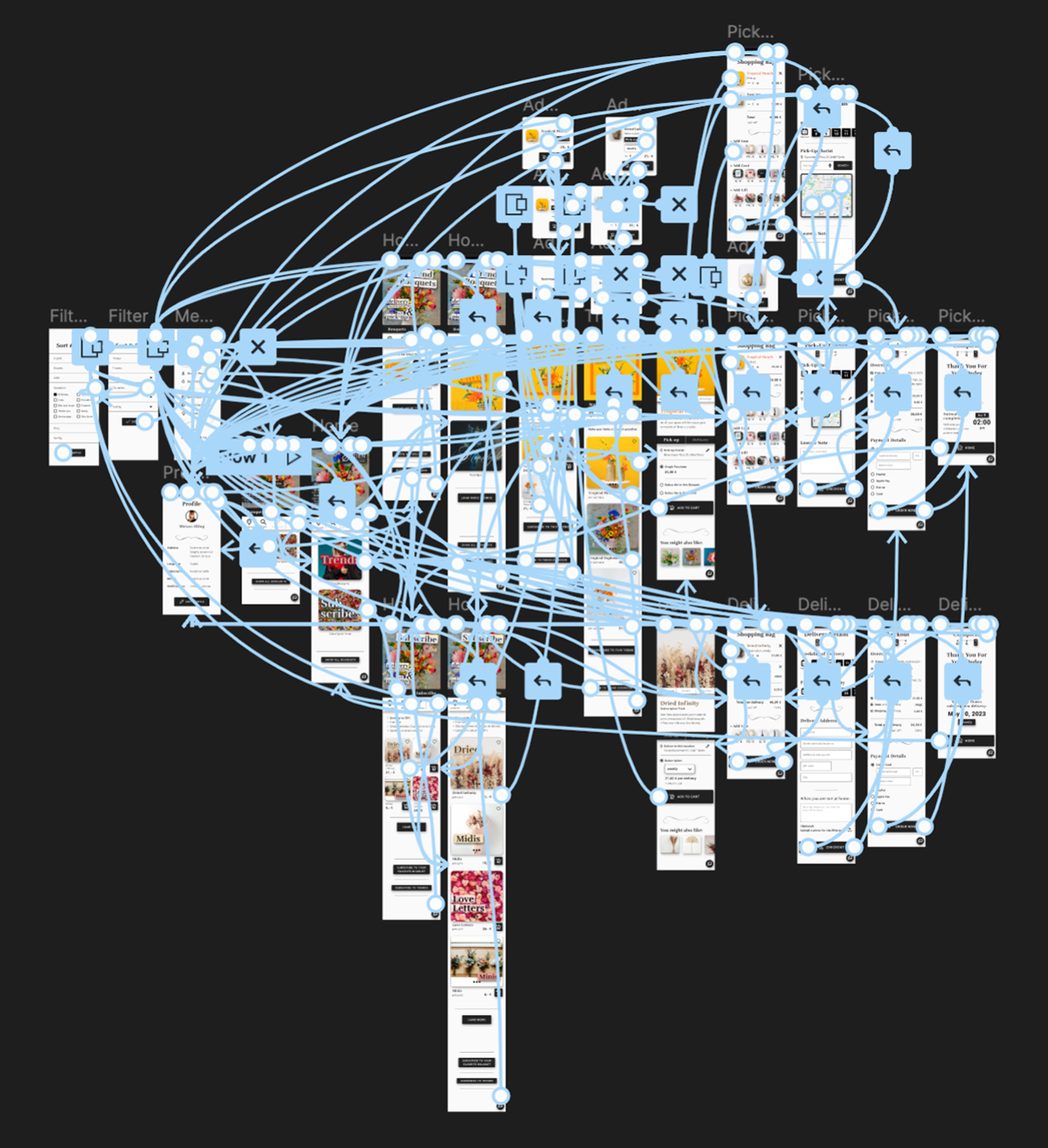
Information architecture / Sitemap
Based on the insights of user goals and what a basic user flow looks like from start to finish, I was able to understand the ways users will interact with the app and created the sitemap based on these insights.
Big-Picture and Close-Up Storyboards
Paper wireframes
Taking the time to draft iterations for each screen of the app on paper ensured that the elements that made it to digital wireframes would be well-suited to address user pain points.
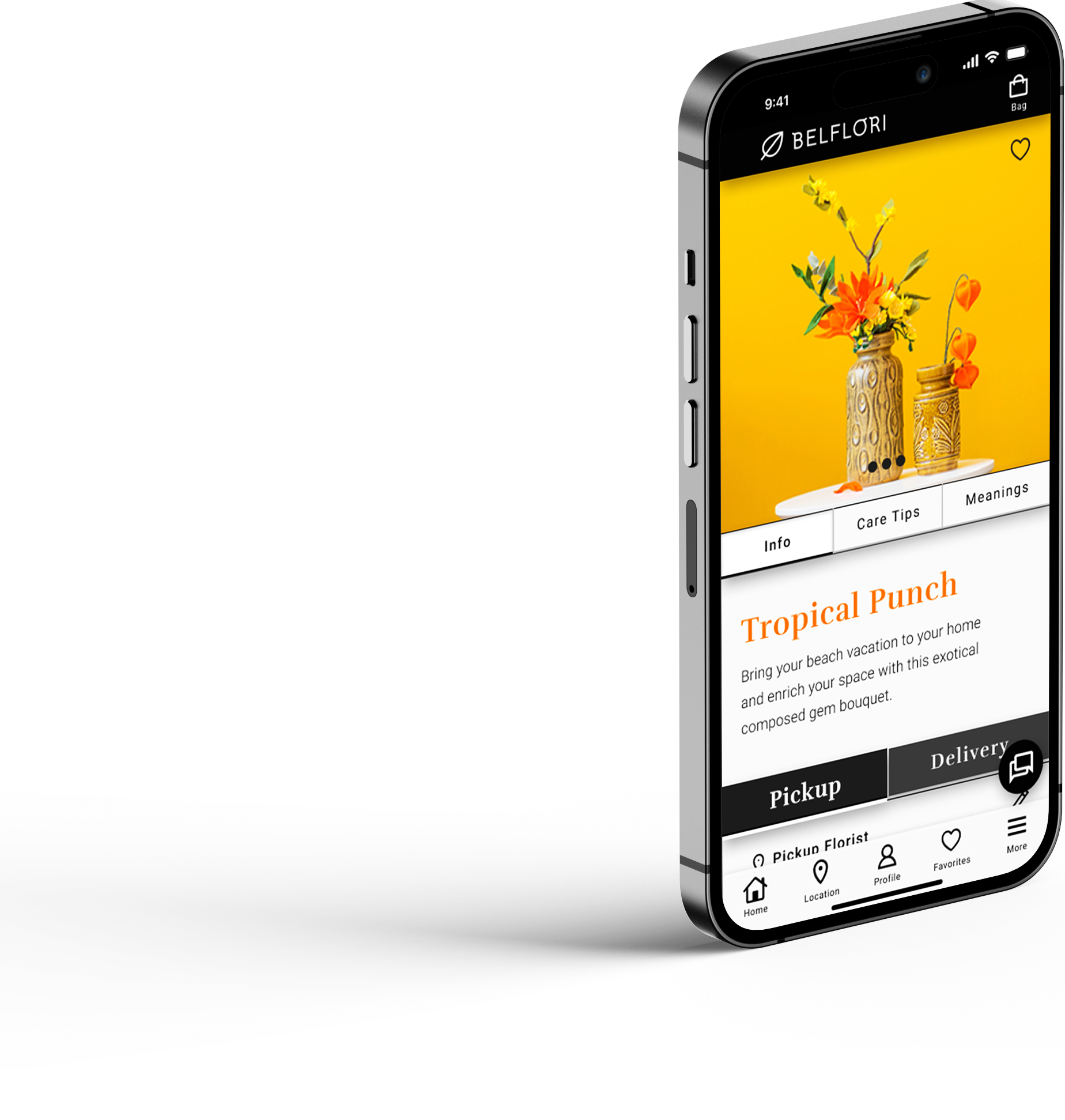
For the item detail screen, I prioritized a quick and easy ordering process to help users save time with the option to easily receive personal support.
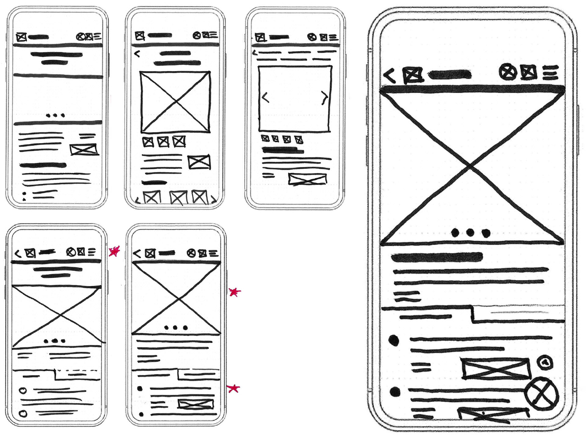
Stars were used to mark the elements of each sketch that would be used in the initial digital wireframe.
Digital wireframes
As the initial design phase continued, I made sure to base screen designs on feedback and findings from the user research.
To meet the qualitative, financial and timely key user needs, I offer the possibility of pre-ordering for flexible self-pickup and delivery by the florist. Both options are combined with the possibility of a one-time purchase or subscription.
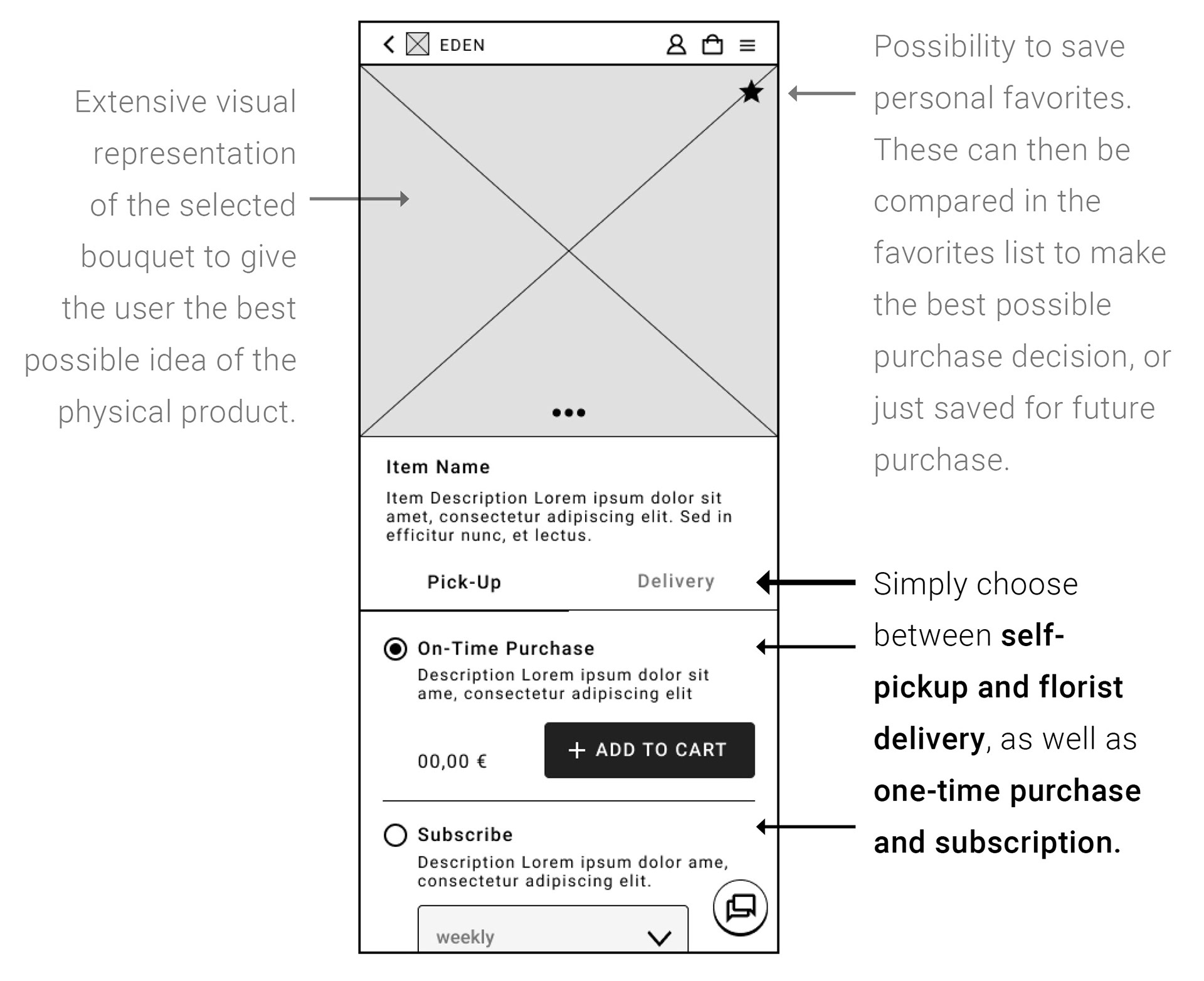
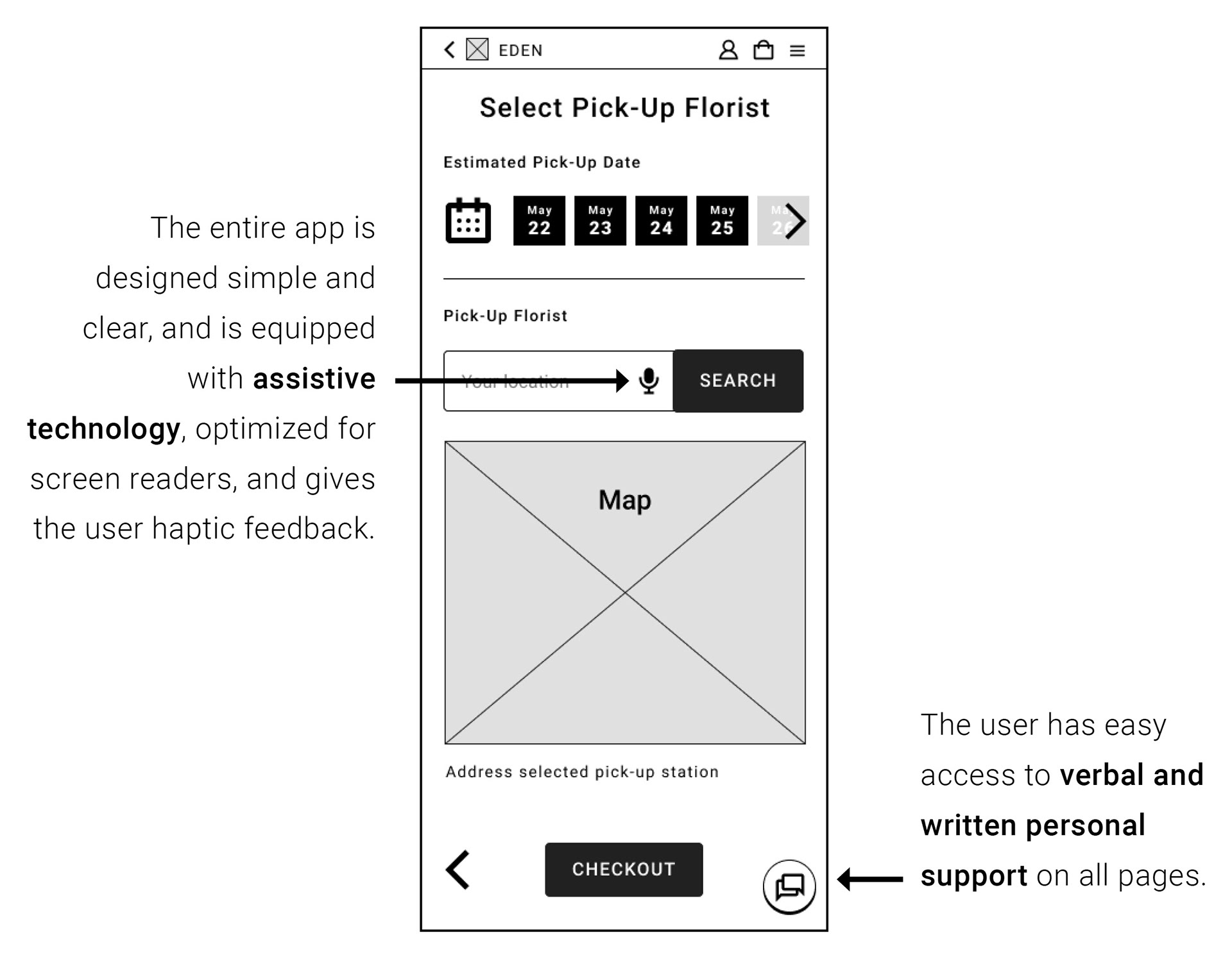
In addition to the qualitative, financial and timely key user needs, the development focused on the key user needs of personal service and accessibility.
Low-Fidelity (lo-fi) Prototype
The lo-fi prototype connected the primary user flow, of selecting a bouquet from the catalog app and ordering it for self pick-up from the local florist, so that the prototype could be used in a usability study with users.
Test the lo-fi prototype in Figma:
Usability Study
4. Finalizing Design
Mockups
Early designs had a rather uniform hierarchy. After the usability study, I clearly defined the hierarchy of elements to draw users' attention in a targeted way.
I also added additional icons to improve accessibility.
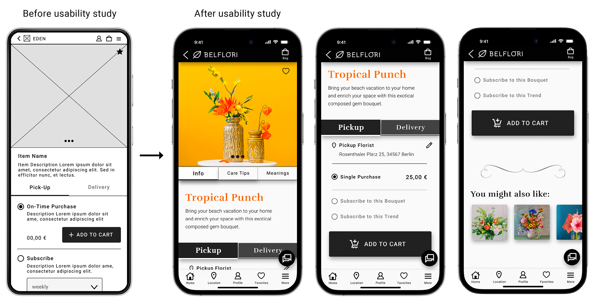
The second usability study revealed that users were confused about the ordering process. The fixed buttons at the bottom of the screen caused scrollable content to be overlooked, and the button label in the shopping bag did not clearly initiate the ordering process.
Therefore, I clearly defined the button label and placed the button at the end of the content.
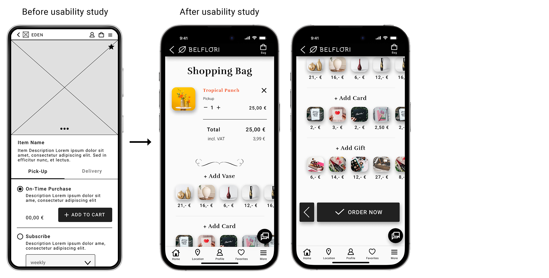


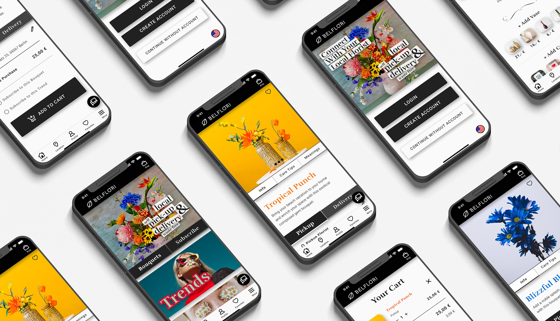
High-Fidelity (hi-fi) Prototype
The final high-fidelity (hi-fi) prototype presented cleaner user flows for ordering bouquets, subscription plans, and checkout process.
Test the functionality with the hi-fi prototype of the 2nd usability study in Figma:
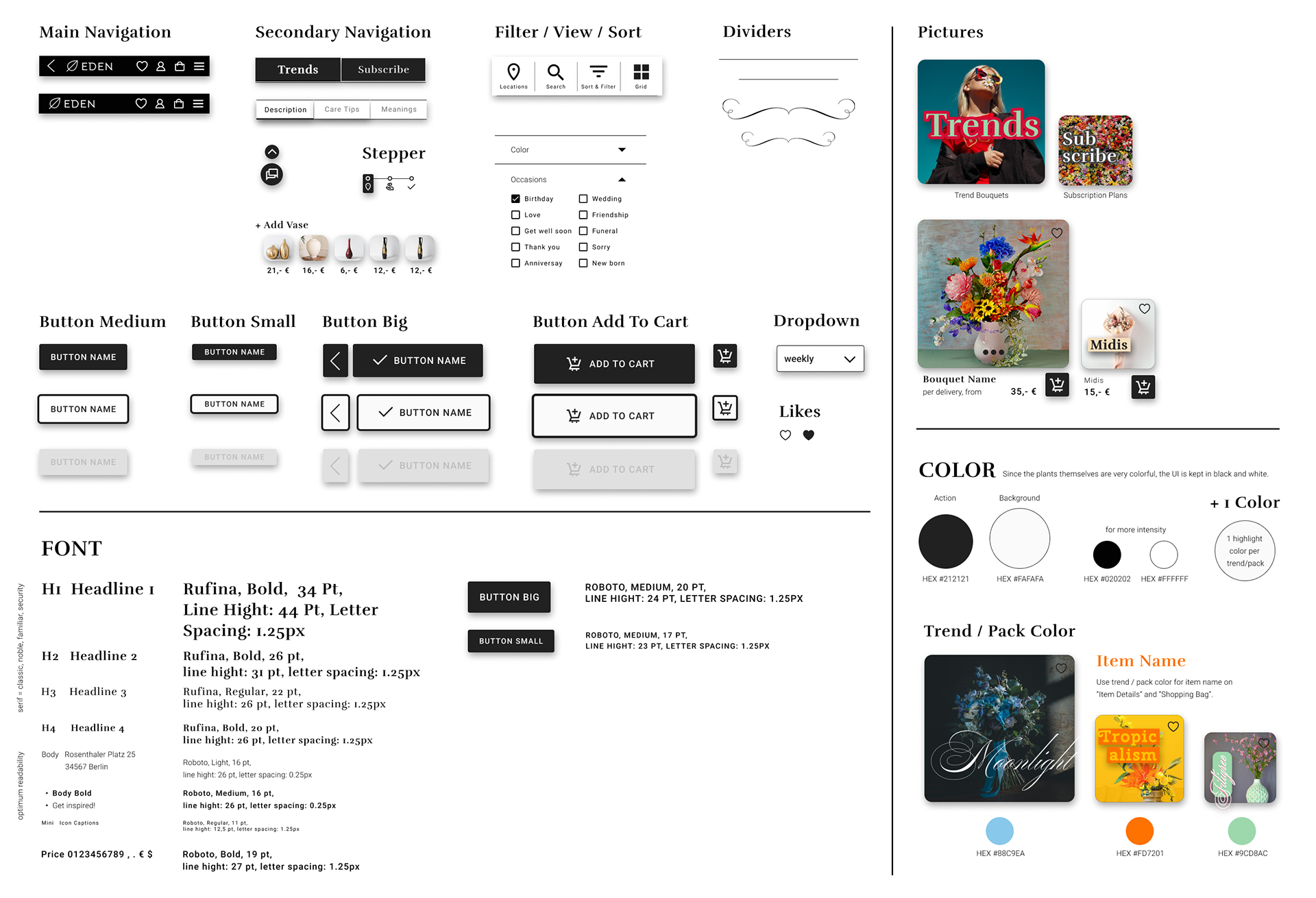
Style Guide / Sticker Sheet
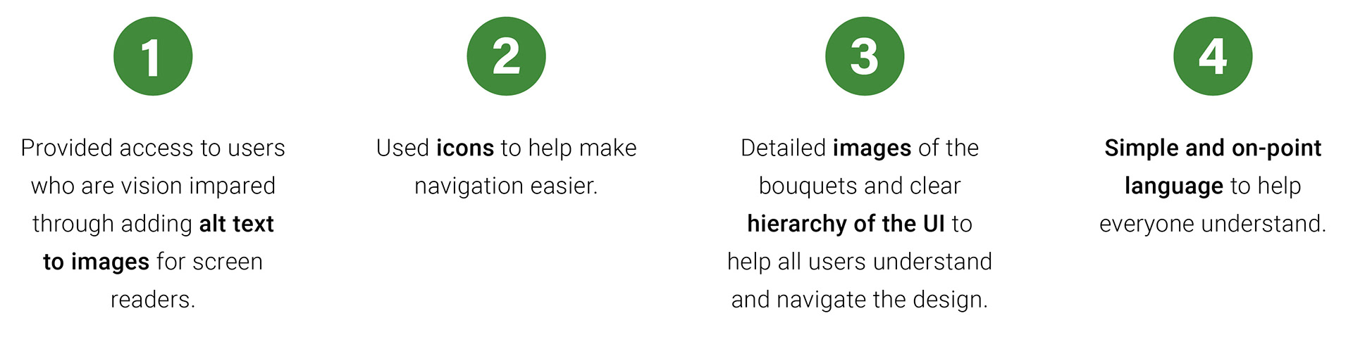
Accessibility Considerations
Accessible design means ensuring that all users have everything they need to feel comfortable on their user journey. A UX designer leaves no one behind, so we include everyone who has a permanent, temporary, or situational impairment. (e.g. only one arm OR sprained wrist OR a squalling newborn on one arm).
5. Going forward
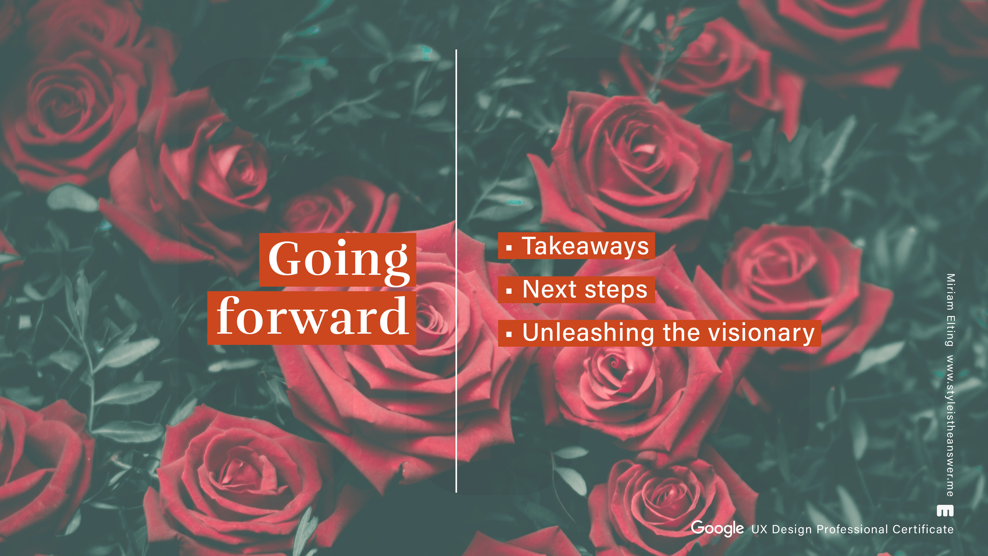
Takeaways
Impact
Navigating and browsing the app is a very enjoyable experience for users, and the concept is of great interest even to male test users who do not typically buy flowers on a regular basis.
Quotes from usability study participants:
"That's awesome! Finally a hip and modern flower store. When is the app coming out? I definitely want a subscription!"
"The app is so easy to use and it's so much fun."
What I learned
While designing the Eden app, I learned that the first ideas for the app are only the beginning of the process. Usability studies and peer feedback influenced each iteration of the app's design. Work put into improving the accessibility for disabled people improved the usability and user experience for all users.
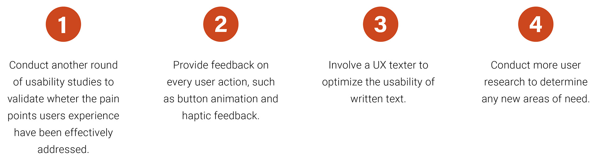
Next Steps
Thank you for your time reviewing my work on this app!
If you'd like to get in touch, feel free to use the contact form.
I would also like to thank Coursera for making it possible for me to take this course for free and Google for providing this extensive and intensive course. Despite my previous knowledge, I was able to expand my knowledge considerably.
Also check out the second project of this course: Responsive web design